ShopDreamUp AI ArtDreamUp

Deviation Actions


Description
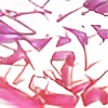
gouache (background)
watercolor (fillin)
DELTA marker (3d)
uniball SIGNO white (outline)
This one has been lying around for a month now and I think I like the way it turned out, here's why:
First of all you can still see the rough pencil sketch under the fillin. It's dirty in that way and I appreciate being able to see some kind of thought process. I generally don't make much of an effort to clean up the pencil sketches and in this expample it actually benefits the product. The watercolor fillin fade turned out nicely even if kind of flat. There are a lot of examples of writers achieving a whole lot by using very little and that is something I generally strive for. As with most concepts that simple, it actually takes a lot of practice to get it right. In this case it might use some highlights, I'm not sure.
I also don't spend a lot of time of thinking about the colors I use since. At least when it comes to markers I don't have a lot of options. It's something I will definetly spend more time figuring out from now on. But in this case the red for the 3D was a nice pick, it frames the the fillin nicely and actually (accidentally) gains some depth because I filled in the letters very boldly, thus darkening the red in the area I used green watercolor.
I cleaned up the 3D with a red ballpoint pen because that's what I've been doing for years now. I was never able to achieve the cleanness I wanted with markers so I use ballpoint pens to clean up the lines, which makes it much more time consuming and also pretty much limits me to black, red and blue for parts I want to able to clean up. It's a major point I want to work on, the way I have been doing this is not effecient at all.
The white outline was neccessary to lift the letters from the background, outherwise it would have been a mess of dark-ish colors.
The background is nothing exciting, again I'm trying to learn here how to use simple geometry and simple coloring to achieve a lot. In this case it didn't work out too well but it doesn't hurt the finished work.
The shadows turned out to be too small, the effect is barely noticeable. I theoretically know how to draw mathematically correct drop shadows as long as they are as simple as in this case but I'm actually making an effort to not do that, hoping that it would vibrant? Didn't work out in this case...
As for the letters, the implied symmetry between the K and the S worked out OK even though I think there is a little too much difference in the negetive space. What bothers me a lot is the space in the R, the A doesn't do nearly enough to keep a proper balance. I think this is also part of the reason the drop shadows don't work as well as I want them to. On the bright side, the way the head of the R lies on top of the body of the A actually works surprisingly well even though it obscures a rather big part of the A, which in turn means you don't get to see how the lower part of it works. In fact, you don't see the shape of the A's leg, which is a mistake I generally try to avoid. Plus, the R is covering the A always and in no part of the letter is the A overlapping the R. I consider that a mistake in balancing, imagining the piece as an object in 3D, KA would be on one level of depth, the R on a second one and the S would stand out the most. That's bad balancing right there! Furthermore, the way the letters overlap is inconsistent: The S cutting into the R similarly to the way the K cuts into the A (at the bottom). The R doesn't cut in though, it comepletely overlaps the A, thus getting way too much attention. It's not generally a mistake but it this case poorly executed.
Aaaand those are my thoughts on this one. It's got a bunch of mistakes but some of them are actually nice ideas, individually.
Thanks for reading, heres some music: www.youtube.com/watch?v=hqR5k5…
If you have any tips, criticism or question, please do share.
If you have any tips, criticism or question, please do share.
Image size
1165x500px 559.79 KB
© 2014 - 2024 cars-ten
Comments2
Join the community to add your comment. Already a deviant? Log In
Great job! 